
Hydrapeak
Design and Packaging Comps

Services
- Die-Line Development
- Color Exploration
- Packaging Design
- Packaging Comps
The Challenge
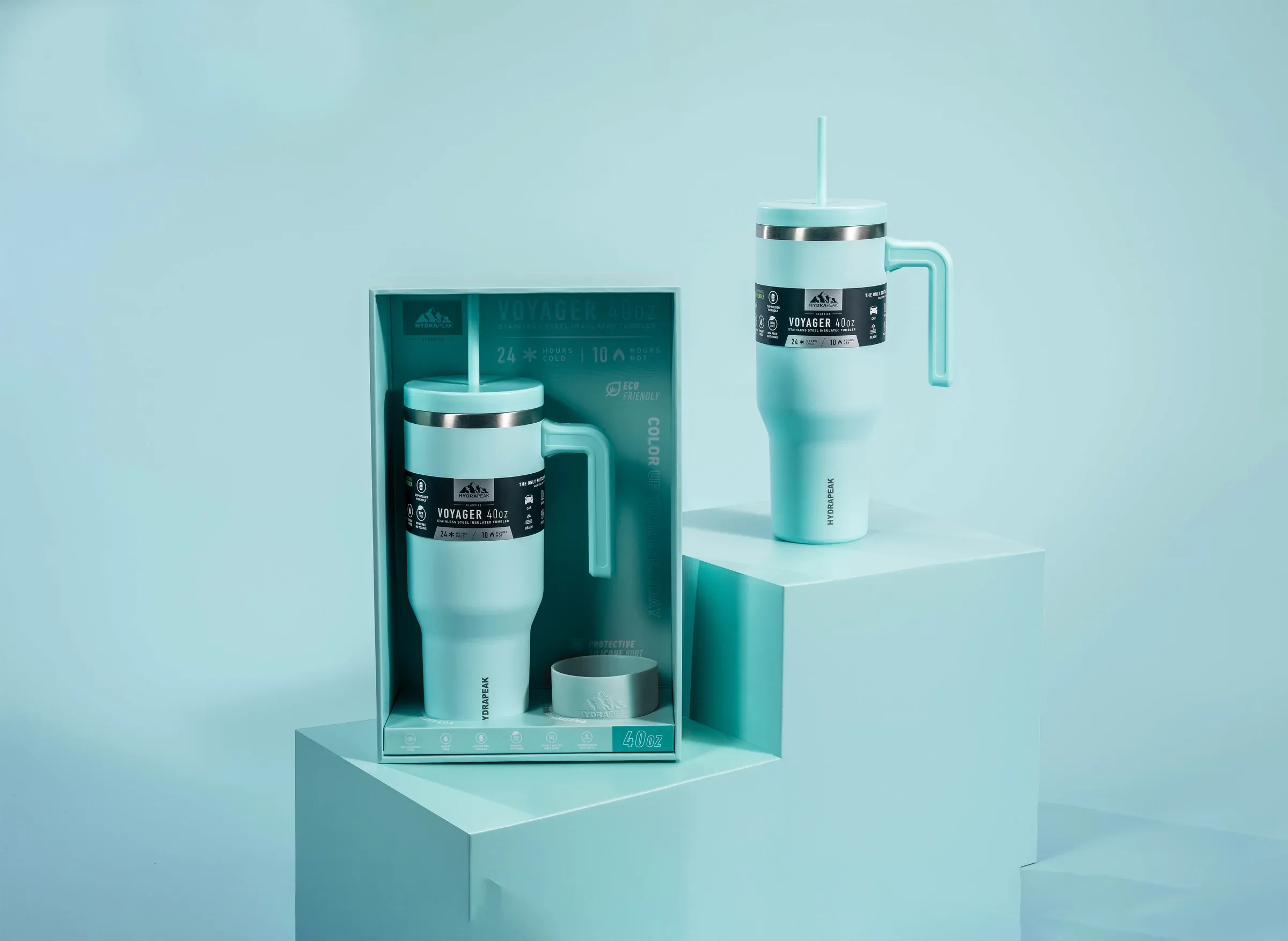
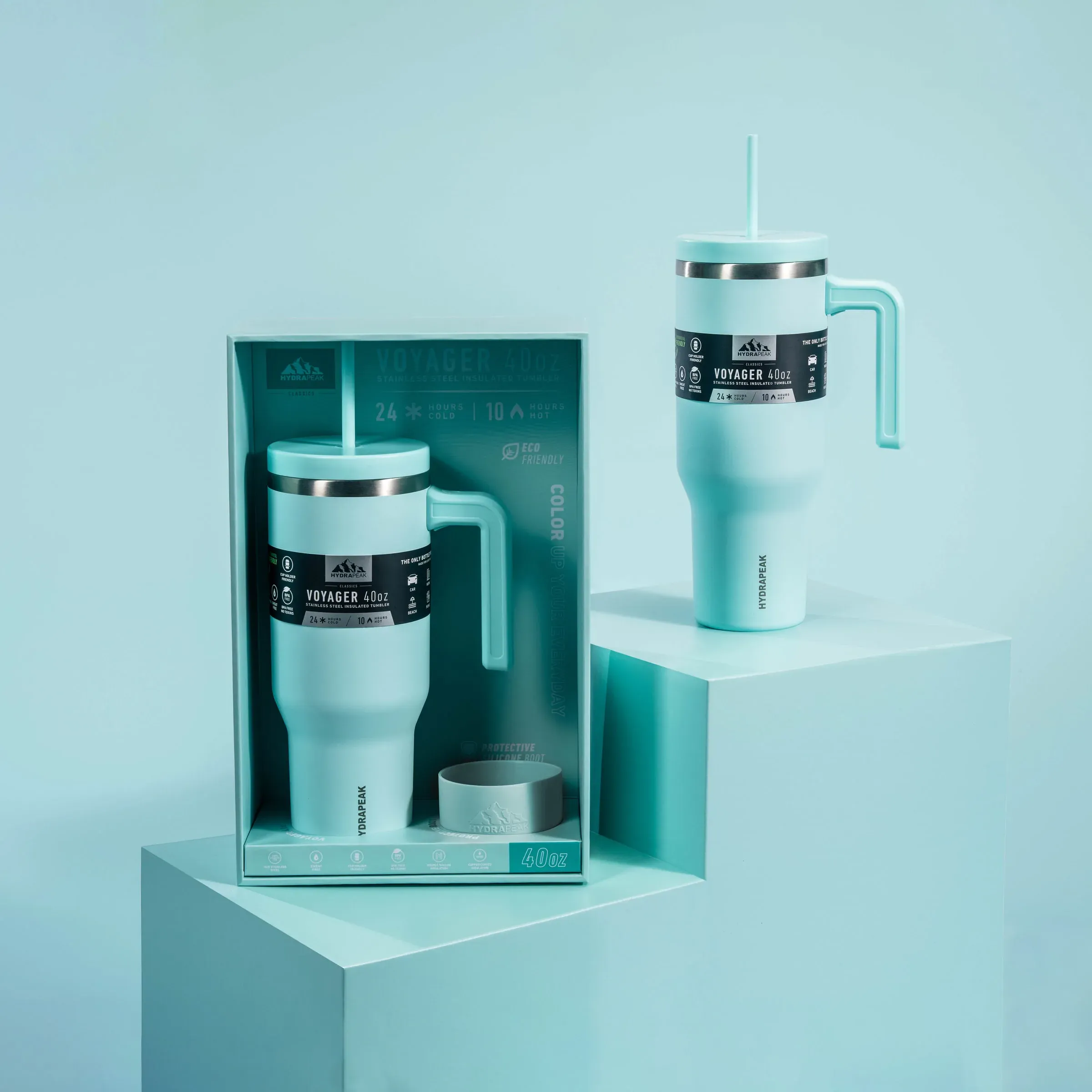
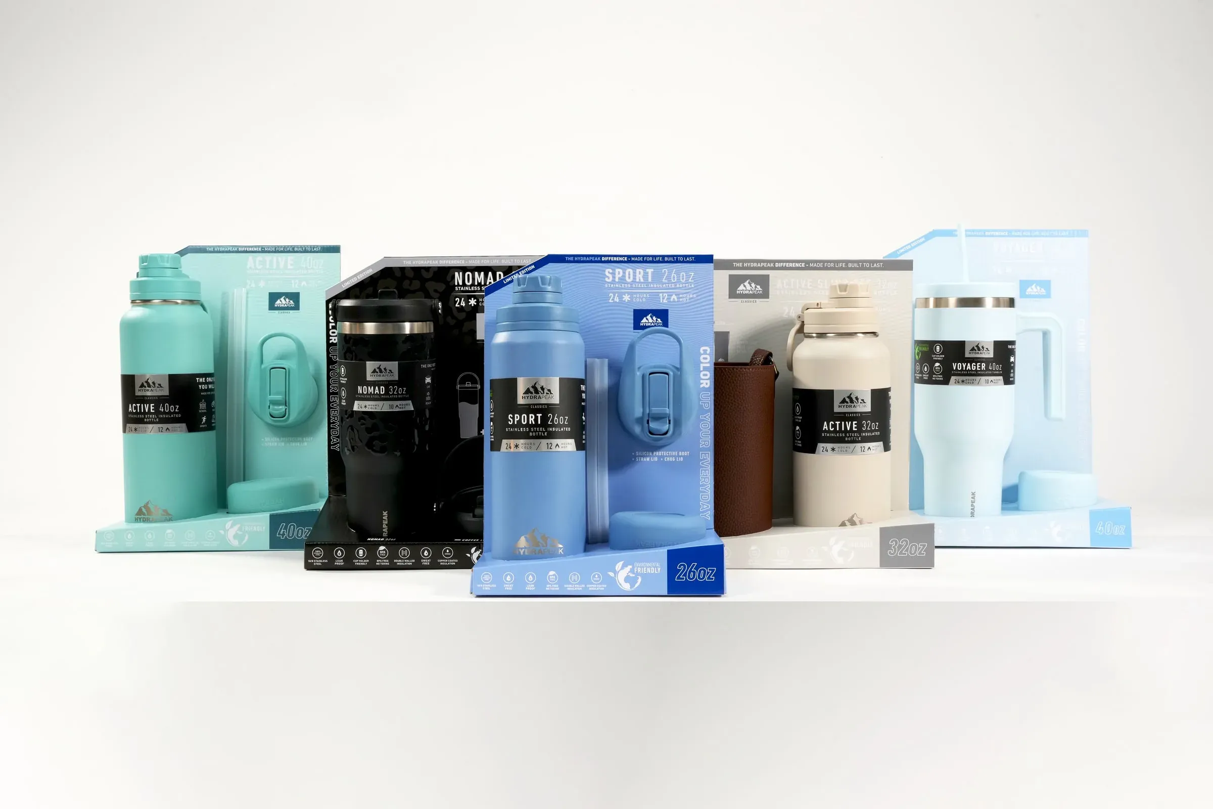
Hydrapeak called on us to create packaging comps for their products to be used for sell-in purposes at retailers for the coming season. They wanted bright, vibrant colors, a consistent design scheme for every SKU, and a die that would make for a unique unboxing and viewing experience for the consumer. Piece of cake.
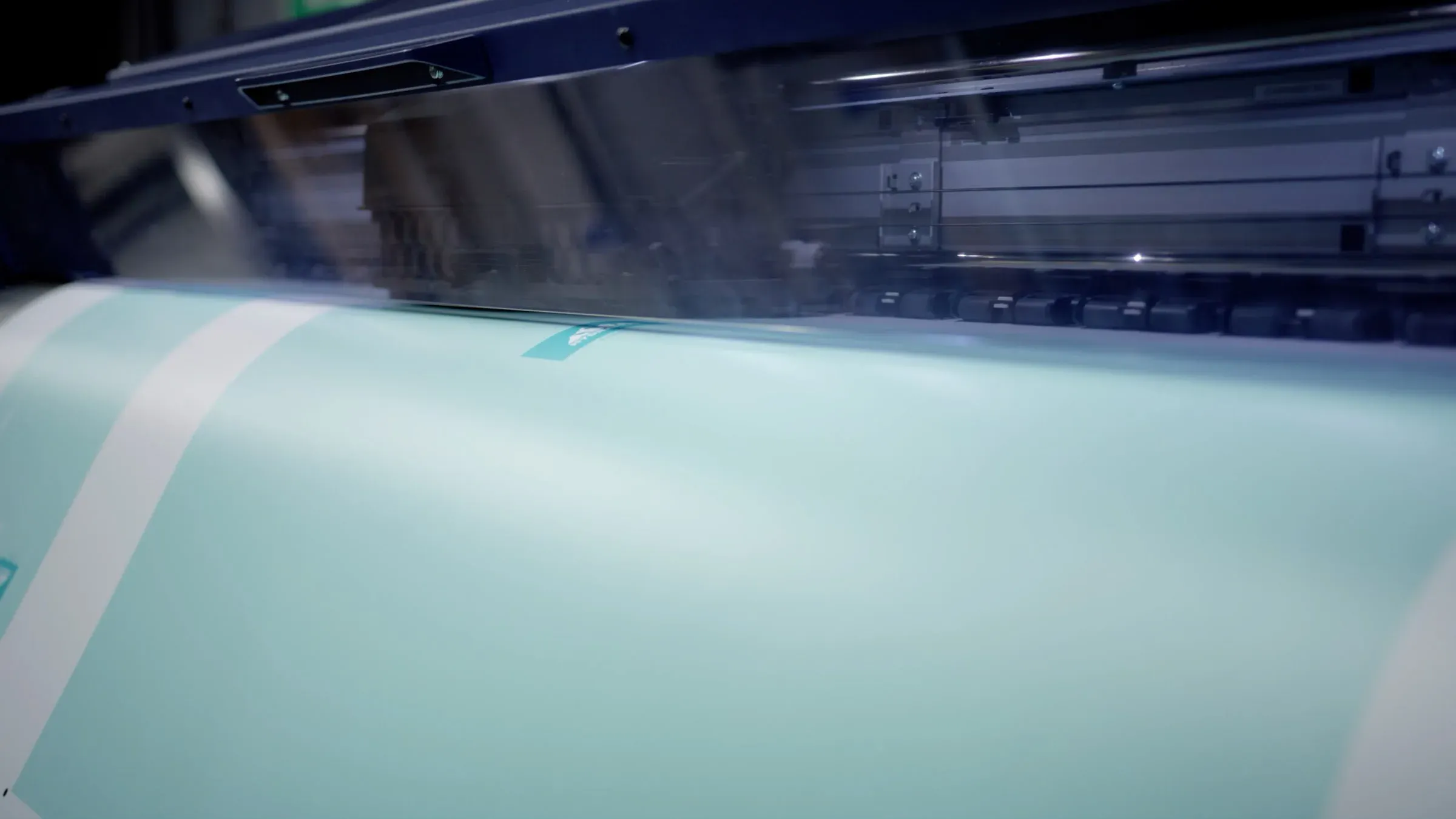
Color Exploration
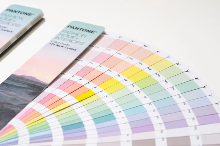
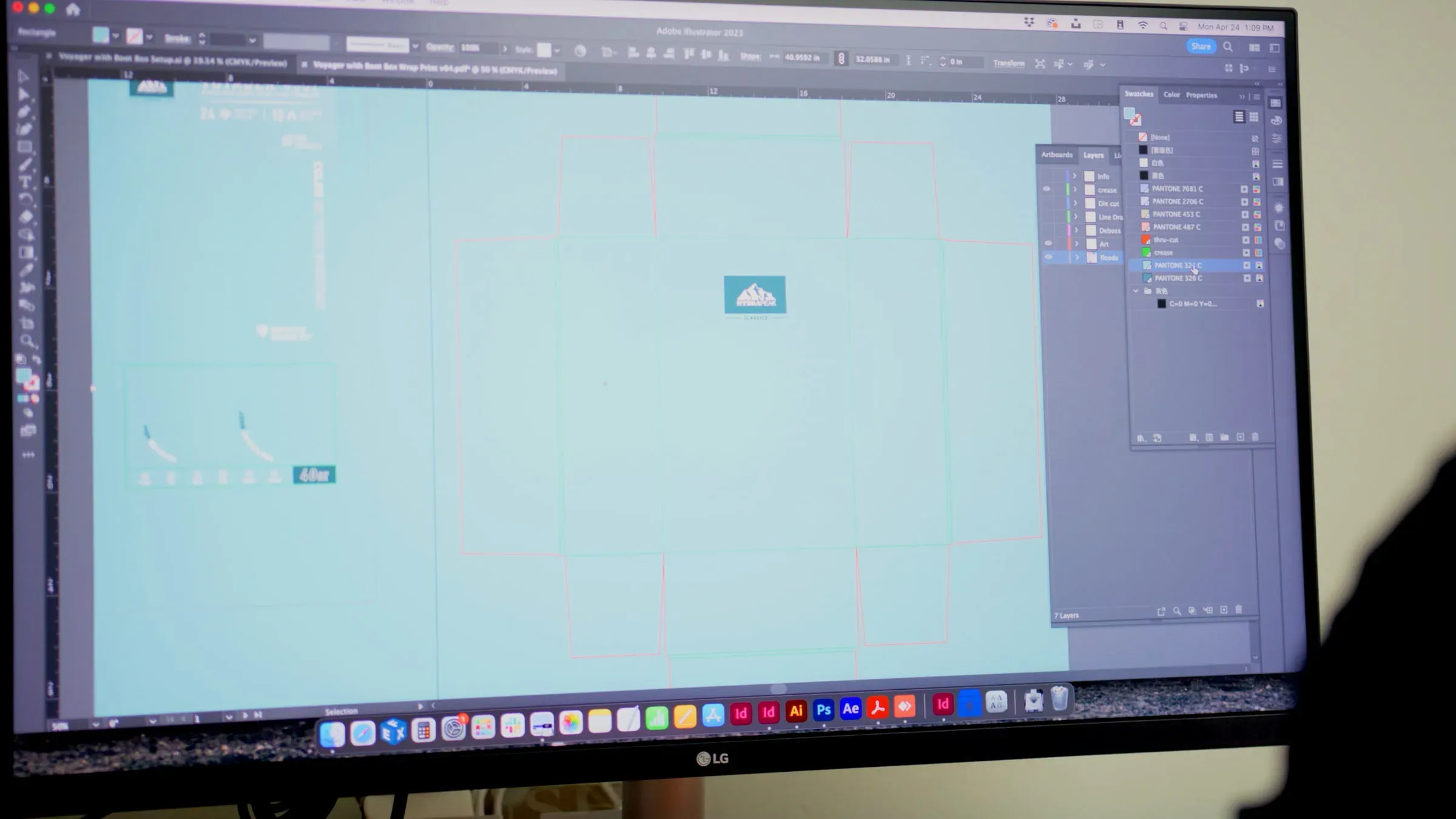
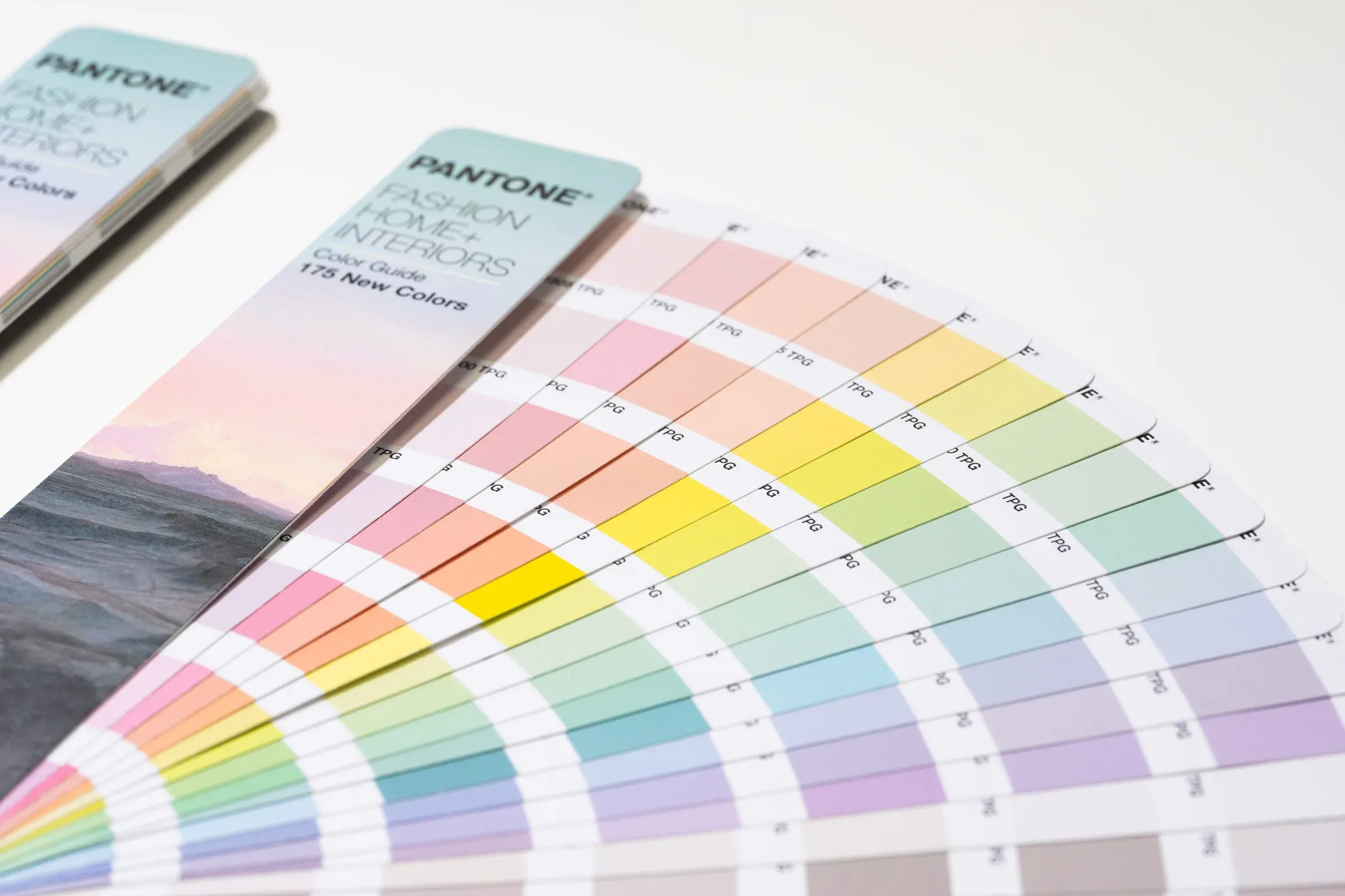
A huge focus of the project was choosing color schemes that fit the theme of each respective SKU, so we made sure to put extra effort and care into choosing the perfect colors for every package. With an extended color gamut, able to reach 97% of the Pantone library, we were able to create beautiful, vibrant comps that were eye-catching, perfect fits for what they held inside.
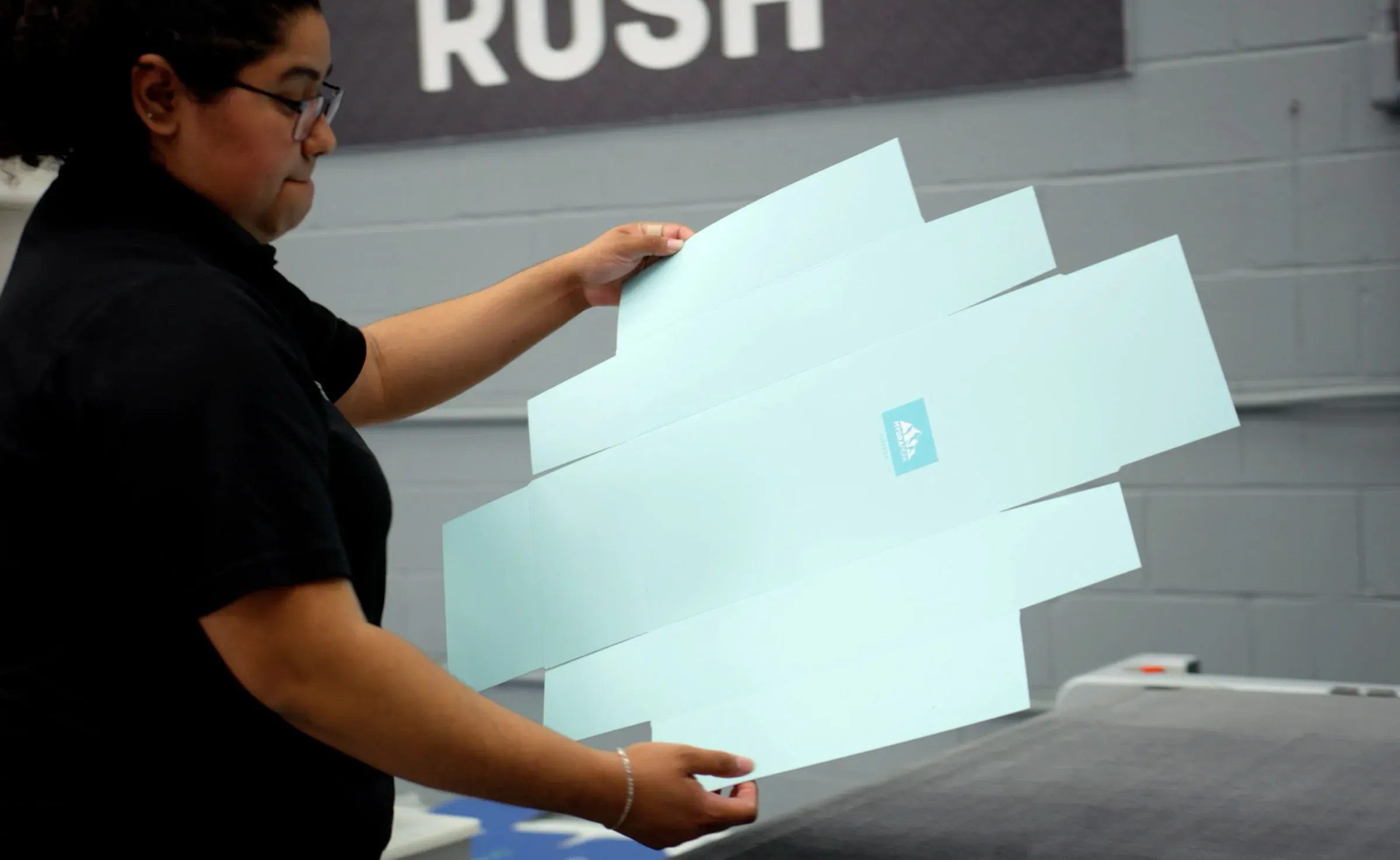
A Die-Line to Die For
One of the most important steps, we created and engineered a die that would make for a sleek, protective package for their various mugs and tumblers. Being careful to keep the product secure and snug, we made sure to size every panel and cut-out precisely to safely hold the products.
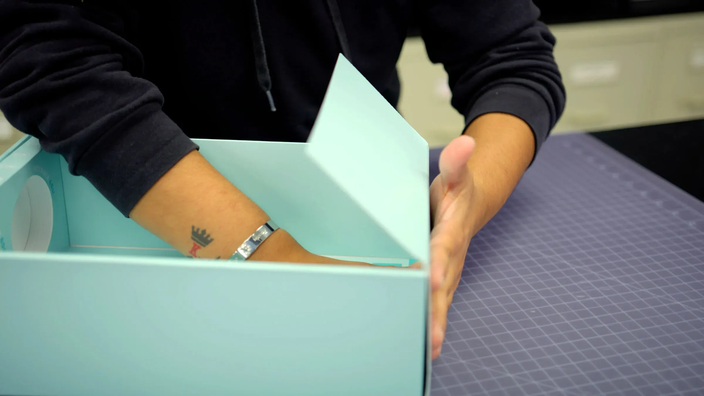
Complete and ready for production
Finally, we assembled each part, and successfully created each comp Hydrapeak needed. With extremely accurate Pantone matching, and an easy assembly process, we made sure that there would be no issue when they moved to large quantity production.
Like what you see?
We would love to do it for you. Tell us about the project and we will tell you how.